Summary Welcome to the Power Platform monthly feature update! We will use this blog to share news in Power Platform from the last month, so you can find a summary of product, community, and learning updates from Power Platform in one easy place. Now, let’s dive into what’s new in Power Platform:
Get started with the latest updates today!
Jump into Power Apps, Power Automate, and Power Pages to try the latest updates, you can use an existing environment or get started for free using the Developer plan.
Join us at PPCC!
See these updates and more come to life at the Power Platform Community Conference 2026 – Join us October 27-29 at the MGM Grand in Las Vegas to discover how organizations are using agents, apps, and automations to drive business outcomes, build new solutions, and scale innovation. Connect with product experts, industry peers, and the community shaping what’s next.
Building modern apps
Generally available: the data grid modern control — a fluent UI grid with search, sorting, selection, and rich column types
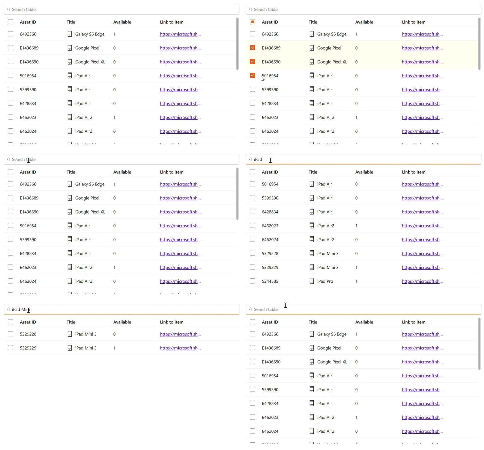
The data grid modern control is now generally available for canvas apps. Built on fluent UI, data grid gives makers a high-performance, data-dense view of tabular data with a built-in search experience. Columns are generated automatically when you connect a data source, and each column can be unlocked for per-column customization with Power Fx formulas. GA rounds out the core interaction model: sortable columns, single and multi-row selection (with an optional selection column), column resizing, and a rich set of column types — text, number, phone, email, hyperlink, and button columns — plus formula-driven cell content for lookups, images, and complex fields. The control ships with built-in accessibility (keyboard navigation and screen-reader support) and fluent theming that stays consistent with the rest of your app, and it now works across a broader range of data sources than the preview. A wave of reliability and authoring fixes (selection stability, sorting, column ordering, and data-grid-in-gallery/component scenarios) landed as part of the GA push.
Data grid is the fluent-based successor to the classic table/data table experience, and a table → data grid update path helps makers move existing apps forward rather than rebuilding. It’s a distinct new control, not a forced replacement.
Modern toggle and checkbox get improvements with consistent properties, tooltips, and true read-only view mode
The modern toggle and checkbox controls have been improved as part of modern controls. Both now follow the same cross-control naming conventions as the rest of the modern set — FontColor → Color, FontSize → Size, and the FontItalic/Underline/Strikethrough renames — and FontWeight now uses typed enum values (FontWeight.Bold, etc.) for IntelliSense and compile-time validation. Toggle’s LabelPosition is also now a typed enum (LabelPosition.Before / LabelPosition.After). Both controls gain a new tooltip property, and DisplayMode.View now renders a genuinely read-only state that shows the value without allowing interaction — consistent with the other updated modern controls. They also expose far more output properties than the previous versions, so you can reference their state in formulas across your app. Checkbox behavior inside galleries (Checked/OnCheck reliability) is improved.
If your app uses a previous version, you’ll see an update notification on the control in Power Apps studio; the migration guide lists each property rename so you can update formula references.
The modern form control gets modern data cards plus binding, formula, and reset fixes for more reliable form building
The modern form experience received a round of functional improvements. Improved data cards are now enabled, so forms built on modern controls render their fields through the updated data-card infrastructure. Alongside that, we fixed data-card binding and formula behavior, so field values, defaults, and Power Fx inside cards evaluate correctly. This makes modern forms behave predictably for real data-entry scenarios.
We also corrected ResetForm and date picker reset behavior: resetting a form now reliably clears and restores field values, including date fields, which is core to edit/new-record form lifecycles. Together these changes make the modern form a dependable foundation for form-driven canvas apps, working end to end with the other updated modern controls.
New fluent 2 app templates give makers a polished, modern-controls starting point for canvas apps
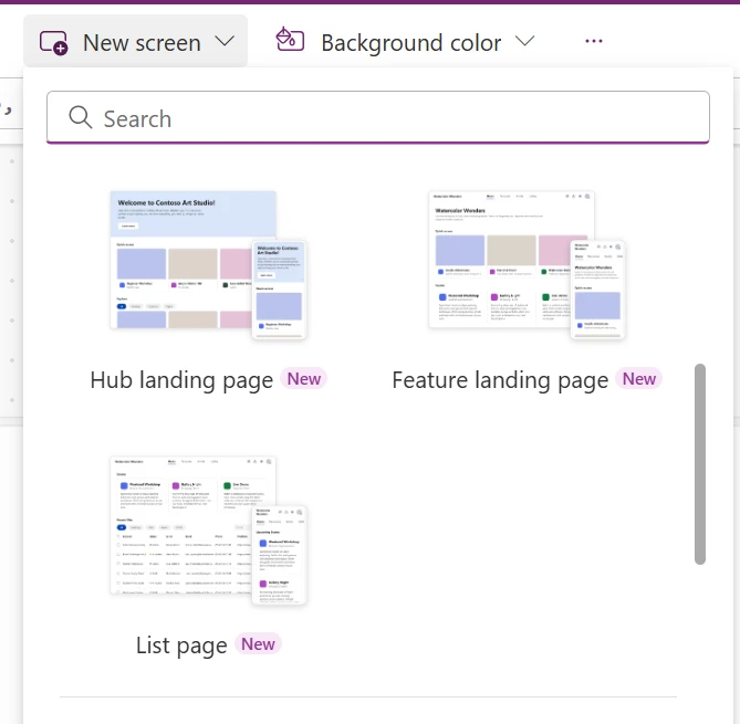
Makers now have new fluent 2-based templates that provide a ready-to-use, professionally designed starting point for canvas apps — built on modern controls and fluent patterns instead of a blank screen. New screen templates include a hub landing page, a feature landing page, and a list page, and the existing modern gallery templates were refreshed to use modern controls throughout.
Because the templates are assembled from the modern control set, apps you start from them inherit consistent fluent theming, built-in accessibility, and the ongoing quality investment in modern controls — so makers get a good-looking, maintainable app faster.
New and improved modern controls: a rating control, richer text styling for card, and an expanded 180-icon library
The modern controls catalog also grew and got richer. A brand-new rating modern control (built on fluent UI v9) lets users give star-based ratings with half-star precision, custom icons (not just stars), and full color customization defaulting to your app’s brand color. It’s a new control — classic rating keeps working unchanged.
The card control gained text-customization properties — fill, plus TitleColor / SubtitleColor / DescriptionColor and TitleSize / SubtitleSize / DescriptionSize.
The modern icon control’s library was expanded from ~56 to ~180 icons, reaching parity with the classic icon set. Classic icon.* values are automatically mapped to their fluent equivalents, so existing usage lights up with the broader set.
Deprecating older fluent UI (hero) controls in custom pages and Teams apps and their upgrade path to the modern controls
Makers who built with the earlier fluent UI (“hero”) controls in custom pages and Teams apps now have a documented upgrade path to the modern controls. The guidance explains how the upgrade works, which properties carry over, and where behavior differs, so you can move to the actively-invested modern control set with confidence. Because some hero properties don’t have a one-to-one equivalent on the modern controls (for example certain color/theming settings), the guidance is explicit about what transfers and what to check after upgrading — reducing surprises and protecting maker trust during migration.
Modern controls are the forward path for canvas and custom-page authoring, while classic controls remain supported for organizations with their own design systems.
Power Automate
Share process license capacity across multiple flows with flow groups
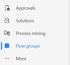
Flow groups are now available in Power Automate. They let you share the capacity of one process license, or 250,000 actions per day, across up to 25 solution-aware cloud flows, helping you make better use of capacity across flows with moderate, predictable usage.
Go to more > flow groups to create a group, add flows, and monitor shared capacity. A flow group uses one process license. When a flow needs more capacity, you can assign process licenses directly to that flow for dedicated capacity.
Share process license capacity with flow groups
Build and manage cloud flows from your AI coding agent with the Power Automate plugin
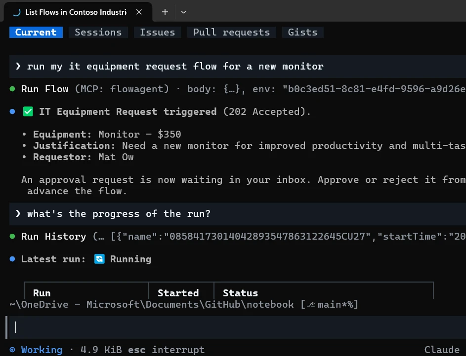
The Power Automate plugin is now available in the Power Platform skills marketplace for GitHub Copilot CLI and Claude Code. It brings common Power Automate tasks into your terminal, so you can create, edit, run, and debug cloud flows through a natural language conversation.
Ask the plugin to build a flow from a description, update an existing flow, investigate a failed run, or help select a working environment and manage connections. Review and test generated definitions and changes before you enable or publish a flow.
Power Pages
Public preview: secure your Power Pages sites with the new security agent

Security agent (preview) is a new AI-powered assistant built into the Power Pages security workspace that helps makers review, configure, and strengthen site security using natural language. Whether you’re reviewing your site’s security posture, configuring authentication and authorization, managing application security settings, or troubleshooting sign-in issues, security agent provides site-specific guidance based on your current configuration. The agent explains findings in plain language, recommends remediation steps, and always requests your approval before making configuration changes, helping you secure your sites faster while staying in control.
Learning updates
Training paths and labs
New
- Audit and retain Dataverse data in Power Platform
- Configure the Dataverse security model in Power Platform
- Deliver solutions with pipelines in Power Platform
- Describe the business value of Microsoft Power Platform
- Drive adoption and transform culture in Power Platform
- Ensure availability and resilience in Power Platform
- Explore the fundamentals of Microsoft Power Platform
- Extend ALM with Git and CI/CD in Power Platform
- Govern AI-enabled resources in Power Platform
- Govern data policies in Power Platform
- Manage environments in Power Platform
- Manage operations and monitoring in Power Platform
- Secure tenants and environments in Power Platform
Updated
- Core components of Power Pages
- Create tables in Dataverse
- Customize a canvas app in Power Apps
- Describe Microsoft Dataverse
- Describe Power Platform governance and administration
- Describe the business value of Microsoft Power Platform
- Explore Power Pages design studio
- Get started with model-driven apps in Power Apps
- Get started with Power Apps canvas apps
- Get started with Power Automate
- Identify basic Microsoft Power Apps capabilities
- Identify Microsoft Power Automate components
- Publish, share, and maintain a canvas app
- Solution Architect: Design Microsoft Power Platform solutions
- Integrate with Dataverse and Azure
Power Apps maker
New
- Configure structured content in the rich text editor (preview)
- Customize Microsoft 365 Copilot in Power Apps (preview)
- Dataverse semantic model frequently asked questions (preview)
- Fine-tune semantic model signals (preview)
- Form modern control in canvas apps – Power Apps
- Manage semantic model glossary entries (preview)
- Overview of Dataverse semantic model (preview)
- Rating modern control in canvas apps – Power Apps
- Regenerate semantic model (preview)
- Upgrade Fluent UI Controls to Modern Controls
Updated
- Add Microsoft 365 Copilot chat for app users in canvas apps (preview)
- Add Microsoft 365 Copilot for app users in model-driven apps
- Business skills overview
- Card modern control in Power Apps
- Choose finance and operations data in Azure Synapse Link for Dataverse
- Column data types in Microsoft Dataverse
- Configure a lookup component on a form
- Configure the Dataverse model context protocol (MCP) server
- Configure your environment and link to Microsoft Fabric
- Connect to Dataverse with model context protocol (MCP)
- Connect to Dataverse with model context protocol FAQ
- Connect to Dataverse with model context protocol in Microsoft Copilot Studio
- Connect to Dataverse with model context protocol in non-Microsoft clients
- Create a business rule in Microsoft Dataverse
- Create a canvas app with data from a list
- Create an Azure Synapse Link for Dataverse with Azure Data Lake in Power Apps
- Create an Azure Synapse Link for Dataverse with your Azure Synapse Workspace
- Create and edit generative pages with AI code generation tools
- Create and use business skills
- Create Apps, Data, and Plans With Power Apps Vibe
- Create custom help pages for model-driven apps
- Customize and build your mobile app using the wrap wizard
- Customize Microsoft 365 Copilot in Power Apps
- Data Grid modern control in canvas apps – Power Apps
- Design a custom page for your model-driven app
- Edit form and Display form controls in Power Apps
- Enable preview tools and features in Dataverse MCP server
- Export Microsoft Dataverse data in Delta Lake format
- Frequently asked questions when transitioning from legacy data integration services to Fabric link and Azure Synapse Link for Dataverse
- Generate a page using natural language with model-driven apps in Power Apps
- Get started with formulas in canvas apps
- Icon modern control in canvas apps – Power Apps
- Link your Dataverse environment to Microsoft Fabric and unlock deep insights
- List of controls available for model-driven apps
- Modern controls and properties in canvas apps
- Power Apps grid control in Power Apps
- Prompt columns in Microsoft Dataverse
- Query and analyze the incremental updates with Azure Synapse Link for Dataverse
- Recent modern control updates in canvas apps – Power Apps
- Release channel for your model-driven app
- Table control in Power Apps
- Transport Azure Synapse Link for Dataverse configuration
- Understand canvas-app forms
- Use environment variables in Power Platform solutions
- Use managed identities for Azure with your Azure data lake storage
- Use modern themes in Power Apps
- Use the Fluent UI controls in Power Apps app in Microsoft Teams
- What is Dataverse intelligence?
- Configure a row summary for a model-driven app
- Types of tables
Power Apps user and mobile
New
Updated
- Assign a row to someone else
- Install the Power Apps mobile app
- Mobile offline limitations for canvas apps
- Modern, refreshed look for model-driven apps
- Use Microsoft 365 Copilot in canvas apps (preview)
- Use Microsoft 365 Copilot in model-driven apps
Power Automate
New
- AI-assisted UI automation repair (preview)
- Create a process from normalized schema (preview)
- Create and manage a flow group
- Normalized schema JSON authoring
- PGP cryptography reference for Power Automate for desktop
- Share Process license capacity with flow groups
- Trigger actions reference
Updated
- Actions reference
- Change the owner of a cloud flow in Power Automate
- Cloud flow error code reference – Power Automate
- Create an Object‑centric event log
- Create flows from your phone in the Power Automate mobile app
- Create widgets for instant flows
- Customize layouts in the process intelligence experience
- Data loss prevention (DLP) policies
- Explore the cloud flows designer
- Filter by attribute values in the process intelligence experience
- Filter by edge in the process intelligence experience
- Filter by timeframe in the process intelligence experience
- Filter by variant in the process intelligence experience
- Filtering overview in the process intelligence experience
- Flow Checker
- Governance in Power Automate for desktop
- Ingest an object-centric event log
- Limits of automated, scheduled, and instant flows
- Manage approvals in the Power Automate mobile app
- Manage cloud flows in the Power Automate mobile app
- Manage tabs in the process intelligence experience
- Manage variables and the variables pane
- Monitor your flows
- OCPM process overview
- Operator role for Power Automate
- Overview of cloud flows
- Overview of object‑centric process mining
- Power Automate mobile app overview
- Process capacity
- Process intelligence experience overview
- Receive notifications in the Power Automate mobile app
- Run a desktop flow in picture-in picture
- SAP GUI automation actions reference for Power Automate for desktop
- Self-healing (preview)
- Submit a cloud flow template to the Power Automate gallery
- Support for service principal owned flows
- Tags in desktop flows
- Understand flow failure notifications in Power Automate
- Use donut charts in the process intelligence experience
- Use filters in OCPM analysis
- Use horizontal bar charts in the process intelligence experience
- Use KPI (key performance indicator) cards in the process intelligence experience
- Use line charts in the process intelligence experience
- Use process maps in the process intelligence experience
- Use statistical grids in the process intelligence experience
- Use variant DNA in the process intelligence experience
- Use vertical bar charts in the process intelligence experience
- Visualization cards overview in the process intelligence experience
- Visualize processes
- Work with desktop flows using code
- Secure data used in cloud flows
Power Pages
New
Updated
- Add a custom domain name
- Add a search component
- Add AI features in a list (preview)
- Add AI-generated code using Copilot (preview)
- Add an agent available in Microsoft Copilot Studio
- Add an agent from the setup workspace
- Add an AI-generated form using Copilot
- Advanced Settings
- Build an agent from a form
- Configure a site with Content Delivery Network
- Configure managed rules in Power Pages WAF
- Configure Microsoft Entra ID Authentication for Power Pages Agent
- Configure Omnichannel with Power Pages site agent
- Configure Web Application Firewall custom rules
- Connect to Power Pages MCP server
- Copilot hub for Power Pages
- Create an AI-generated web page using Copilot
- Create and deploy a single-page application in Power Pages
- Customize your agent
- Enhanced data model
- Get started with the Power Pages plugin for GitHub Copilot CLI and Claude Code
- Implement privacy protections
- Known issues for Power Pages
- Migrate Power Pages website configuration
- Overview of developer capabilities
- Overview of the Power Pages portals Web API
- Overview of the Security workspace
- Power Pages connectivity to a Microsoft Dataverse
- Power Pages security
- Security agent (preview)
- Set column permissions
- Set table permissions in Power Pages
- Set up DocuSign integration
- Set up telemetry monitoring
- Sign up for a free trial
- Tutorial on how to use Power Platform CLI with Power Pages
- Use Power Platform pipelines with Power Pages
- Web Application Firewall overview
AI Builder
Updated
- AI Builder in SharePoint with document processing overview – AI Builder
- Licensing and Copilot Credits
Power Platform connectors
Updated
Power Platform administration
New
- Automate bill copy requests with Power Platform
- Configure authentication for agents (preview)
- Configure channel publishing and connected agent access (preview)
- Copilot Agent Kit real-world examples
- Environment group rules gallery
- Grupo Bimbo standardizes global audit processes with Copilot Studio
- Integrate Dataverse with enterprise data in Microsoft Fabric using a medallion architecture
- Integrate Outlook and SAP with Power Apps
- Manage advanced connector policies programmatically
- Manage healthcare stakeholder engagement with Power Platform
- Power Platform inventory sample queries
- Set up Power Platform managed identity version 1 for Dataverse plug-ins
- Configure sensitivity labels for emails
Updated
- Access audit data with Azure Synapse Link and Power BI
- Actions Overview
- Admin deployment page
- Admin user management unification for Finance and Operations in Power Platform admin center (preview)
- Administer the catalog
- Administration mode
- Advanced connector policies
- Allow external language models for generative responses
- App object in Power Apps
- Auto-claim policies for Power Apps licenses
- Auto-claim policies for Power Automate licenses
- Automate service order lifecycle and SLA governance with Power Platform
- Automatic deletion of Power Platform environments
- Automation of tasks with PowerShell
- Back up and restore environments
- Block unmanaged customizations in Dataverse environments
- Business continuity and disaster recovery
- Compliance
- Configure Dataverse search for your environment
- Configure pipelines using a custom host
- Connector endpoint filtering (preview)
- Continuously optimize performance recommendation for Power Platform workloads
- Control user access to environments with security groups and licenses
- Control which apps are allowed in your environment
- Conversation diagnostics in Azure Application Insights
- Copilot Studio reference architectures and solution ideas
- Create alerts for your resources
- Create and manage masking rules
- Create pipelines using the platform host
- Create users
- Daimler Truck transforms policy management with Power Apps, Dataverse, and managed environments
- Data policies for managed environments
- Data protection and privacy
- Dataverse capacity-based storage details
- Dataverse capacity-based storage overview
- Dataverse Git integration setup
- Deep dive on specific licenses
- Default OrgDBOrgSettings for server-side synchronization
- Define roles and responsibilities
- Design a reliability testing strategy recommendation for Power Platform workloads
- Deutsche Bahn empowers citizen developers with Power Platform
- Develop a tenant environment strategy to adopt Power Platform at scale
- Dynamics 365 service description
- Enable cross-geo solution deployments in Power Platform
- Enable maker welcome content
- Enable managed environments
- Ensure data retention and mobility
- Environment groups
- Environment management capabilities
- Environment routing
- Establish a security baseline recommendation for Power Platform workloads
- Establish effective application lifecycle management practices
- Explore Power Platform and SAP integration
- Export data to Application Insights
- FAQs about source code integration
- Filter, Search, and LookUp functions
- Geo-to-geo migrations
- Hierarchy security
- How managed solutions are merged in Power Platform
- Identity and access management
- Implement a scalable notification system with Power Platform
- Implement reactive governance controls
- Important changes (deprecations) coming in Power Platform
- Integrate Power Platform with SAP for data management
- Integrating SAP with Power Platform FAQs
- IP firewall in Power Platform environments
- Issues and FAQs about pay-as-you-go plans
- Licensing
- Limit sharing
- Manage and govern the default Power Platform environment
- Manage Power Apps
- Manage Power Platform adoption at scale
- Manage your customer-managed encryption key
- Managed availability
- Managed environments overview
- Managed operations
- Metrics and recommendations for Power Apps
- Microsoft Azure Virtual Network support
- Microsoft Dataverse reference architectures and solution ideas
- Modernize applications with Power Platform
- Monitor the health of your resources
- Monitor with the CoE Power BI dashboard
- Move apps from the default environment (preview)
- Move data across regions for Copilots, AI agents, and generative AI features
- Notifications for Business & Industry Copilot services
- Overview of pipelines in Power Platform
- Overview of Power Platform and Copilot Studio reference architectures
- Overview of unified admin experience for finance and operations apps
- Performance testing recommendation for Power Platform workloads
- Plan mission critical workloads
- Power Apps reference architectures and solution ideas
- Power Automate licensing FAQ
- Power Automate reference architectures and solution ideas
- Power Pages architecture key concepts and solution ideas
- Power Platform and Copilot Studio real-world case studies
- Power Platform and Dynamics 365 datacenter regions
- Power Platform and Dynamics 365 macro region geography
- Power Platform Center of Excellence (CoE) Starter Kit overview
- Power Platform inventory
- Power Platform inventory schema reference
- Power Platform licensing FAQs
- Preview and experimental AI models
- Programmability and Extensibility – Power Platform API – 2020-10-01 – List tenant settings (preview)
- Programmability and extensibility – What’s new or changed
- Recommendations for standardizing tools and processes
- Requirements to integrate SAP with Power Platform
- Role-based security roles for Dataverse
- Safeguarding Dataverse sessions with IP cookie binding
- Secure a development lifecycle recommendation for Power Platform workloads
- Securely access customer data using Customer Lockbox in Power Platform and Dynamics 365
- Security overview
- Set a default pipeline
- Set up Application Insights with Power Automate
- Set up default sync filters for multiple users for appointments, contacts, or tasks
- Set up Power Platform managed identity for Dataverse plug-ins or plug-in packages
- Set up virtual network support for Power Platform
- Solution checker enforcement in managed environments
- Solution ideas for Power Platform and Copilot Studio
- Special system users and application users
- Telemetry events for model-driven apps
- Tenant settings
- Tenant-to-tenant migrations
- The City of Montréal enhances citizen engagement with Copilot Studio
- Track, manage, and scale Copilot adoption in the Power Platform
- Tutorial: Assign roles to service principals (preview)
- Types of Power Automate licenses
- Unified environment types and templates for finance and operations apps
- Usage insights
- Use /mention to link to business records
- View and download Dataverse analytics
- View license consumption for Power Apps (preview)
- View license consumption for Power Automate (preview)
- View licensing and capacity recommendations
- View Microsoft Dataverse and model-driven app activity logs in Microsoft Purview
- View operational efficiency recommendations
- View security recommendations
- What’s new in Microsoft Power Platform guidance
- What’s new in the Power Platform and Copilot Studio Architecture Center
- Authenticating to Power Platform services
- Best practices for server-side synchronization
- Configure user security in an environment
- Connect Gmail accounts, POP3 email server, or SMTP email server by using credentials specified by a user or queue
- Connect to Exchange Online
- Connect to Exchange Server (on-premises)
- Connect to IMAP or POP servers
- Delete users from an environment
- Integrate (synchronize) your email system
- Manage user settings as a Microsoft Power Platform administrator
- Managed security
- Server-side synchronization between customer engagement apps and email servers
- Set up server-side synchronization of email, appointments, contacts, and tasks
Power Platform developer
New
- How to: Create a connection from the CLI (preview)
- How to: Sign in and manage accounts with the Power Apps CLI – Power Apps
- Push a code app into a solution from the CLI (preview)
- Quickstart: Build a code app with GitHub Copilot
- Use SQL to Query Data With the Dataverse Web API
Updated
- Access external web services (Microsoft Dataverse)
- Add Power Automate flows to a code app (preview)
- Analyze plug-in performance (Microsoft Dataverse)
- Authenticating .NET applications (Microsoft Dataverse)
- Build and package plug-in code
- Column definitions
- Continuous integration and deployment
- Create and use custom APIs (Microsoft Dataverse)
- Create Workflow Extensions for Microsoft Dataverse
- Delete Data in Bulk to Reduce Storage Use
- Frequently asked questions
- How to: Add a Dataverse action or function to your code app
- How to: Connect your code app to data
- How to: Quickstart with npm CLI (preview)
- Microsoft Power Platform developer tools
- Migrate from Power Apps Test Engine to Power Platform Playwright samples
- Power Apps code apps overview
- Power Apps Developer Plan Guide: Features and Benefits
- Power Platform Playwright Samples Overview
- Query data
- Retrieve a table row using the Web API
- Specialized columns using code
- Supported customizations for Microsoft Dataverse
- System configuration
- Transition client applications to Dataverse ServiceClient
- Tutorial: Create workflow extension (Microsoft Dataverse)
- Tutorial: Write and register a plug-in (Microsoft Dataverse)
- Understand dashboards: Dashboard components and FormXML (model-driven apps)
- Use an alternate key to reference a record
- Use Microsoft Dataverse Web API functions
- Use OAuth authentication with Microsoft Dataverse (Dataverse)
- Use SQL to query data (Microsoft Dataverse)
- Verifying access in code (Microsoft Dataverse)
- View data with visualizations (charts) (model-driven apps)
- Visual Studio and the .NET platform
- Work with Microsoft Entra ID group teams (Dataverse)
- Write a custom Azure-aware plug-in (Microsoft Dataverse)
- Write a plug-in (Microsoft Dataverse)